Interior Design: Paint Colors used in Project Oakdale
- Jan 16
- 4 min read
Interior Design and Paint Colors
Paint colors are simple yet complex. Super clear right? Paint colors are often used for tricks in interior design. What I mean by that is that choosing a simple white for all walls in a new build can really allow for a calm backdrop and blank slate for potential buyers to imagine all of their furniture in the home. Paint colors can also add depth to a space and trick the eye into seeing (or not seeing) items in a space. I am a firm believer that interior design paint colors make a house a home and help tell a story. In this blog post I share our paint colors we used for our personal residence and the WHY I chose what I chose. Enjoy!


Guest Bedroom
Our guest room is probably my favorite room in the house. We used the dark moody color Farrow and Ball Down Pipe in a couple places in our house because it is such a versatile color and it really changes depending on the light. In the morning during the spring and summer when the sun is rising through the windows it can yield a darker green hue. Our home is surrounded by a lush green landscape during the warmer months so that really affects how much green is seen with this paint color. During the winter and less light it is more of a blue/ gray.

Living Room
For our living room, I chose an unlikely paint color for the walls. I had orginally painted the walls Benjamin Moore White Dove when we moved in and before we had any of our furniture that we have now. Once we put in the linen sofa in (you can read more about our living room reveal here) I knew the paint color was all wrong. With such a white backdrop that White Dove provides (actually it is an off white with a hint of yellow), it made the sofa look pink. The sofa is vintage Restoration Hardware and they used a more pinkish beige upholstery at that time. White Dove really showed how pink the sofa was. To make the pink in the sofa less noticeable I chose a complex cream paint color that had a slight pink undertone: Benjamin Moore Manchester Tan. Designer trick: if you want to make a color less noticiable, don't ignore it completely but incorporate it in other places in the room.
For the built-in bookcases we used Farrow and Ball Down Pipe again. In this room it is consistantly a deep blue gray because we don't get as much light in this space. I chose a dark color on this built-in wall and a light color everywhere else to add depth to the space and to make the wall appear wider than it is. This is a very long and narrow room which was pretty challenging to address.
The ceiling and trim work in this space is painted Benjamin Moore White Dove.

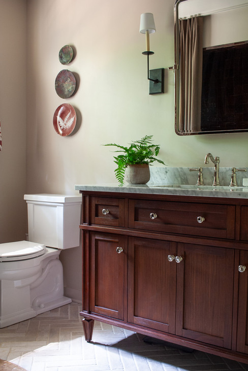


Guest Bathroom
We used Benjamin Moore Inukshuk CC-460 for the walls in our guest bathroom renovation. I wanted a neutral backrop to allow the vanity and the dark maroon zellige tiles to grab the eye's attention. Inukshuk is a a warmer beige that coordinates well with the herringbone tile floor that we used. I did use Benjamin Moore's Aura bathroom paint line for the walls in an eggshell sheen for humidy reasons. For the ceiling I chose a semi gloss finish to have the light reflect off the ceiling. I like to play with the ceiling with high gloss paint when there are no architectural details in the space.

Hallway
All of our doors and trim in the main spaces are Benjamin Moore White Dove, including the hallway's doors and trim. This paired well with the wallpaper we used. For the ceiling I opted to go a bit darker than your typical ceiling paint and chose Benjamin Moore November Rain for a toutch of green.

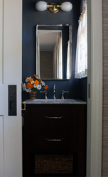


Master Bathroom
For our teeny tiny master bathroom I chose to color drench before it was a thing like it is today. It was one of our first spaces we renovated, you can read more about this renovation here. I decided to paint the bathroom ceiling the same as the walls to trick the eye into thinking that the room is bigger than it is. The walls, ceiling, and trim are paint Benjamin Moore Flint AF-560. It is an afinity color which is formulated to change colors slightly as the light changes. This formulation of paint is really cool.


Basement
The above left picture shows the main gathering room which both the walls and ceiling are painted Sherwin Williams Magnetic Gray. I wanted this space to be calm so choosing a blue would helo acheive that. I made the decision to paint the ceilings the same color as the walls because there wasn't the option to add crown molding with the soffits. Whenever there is no crown molding I opt for the walls to be the same as ceiling so that the eye doesnt notice a sharp contrast in color between wall angles. The HVAC soffits were also painted the same color as the walls because I want to disguise them as much as possible.
The picture above on the right is our TV room (aka "the Snug") and it is painted my favorite paint color in the world: Benjamin Moore Golden Retreiver. I'm not one to go for bold colors in every room but a space that is not a main gathering area is a perfect opportunity to go bold. Yellow makes people happy and its a perfect color for a TV room/ family hangout area/ play room. You can read more about the basement design here.

Front Door
The front door is a perfect place to make a statement. Our house is white brick so I wanted the front door to stand out. The door has original hand carved botanical design that I love so much so I played off the botanical aspect and painted the door Benjamin Moore Herb Garden.
That is it for the paint colors we used in our home, I hope this post helped you in some way. Let me know if you have any questions on paint colors in the comments!


Comments